Random Thoughts: Why You Need a CiO

Call it a natural evolution of business.  As new methods and technology become integrated into our corporate culture, the need for thought leaders to address and lead our organization through these revolutions becomes an increasing necessity.

The creation of the CIO or CTO position…Chief Information Officer or Chief Technology depending on your HR handbook…was a direct result of the technological progress over the last half of the 20th century.

It seems that we are crossing into another decade of change in the structure of our organizations, one focused on the assimilation of interactive technology and marketing into the very fabric of business.

Is it time for the creation of the CiO position? Or, the Chief Interactive Officer.

With a nod to our counterparts in Information Technology or simply IT, let’s acknowledge that IT and Interactive are two very separate disciplines with a vast amount of interconnections.

This is not to say that IT professionals are completely unfamiliar with the strategies and techniques of Interactive Marketing, nor are Interactive peers uncomfortable with servers, data systems and SaaS.  However, it should be recognized that both portions of the average business have grown and advanced to the point where a basic ‘technology’ FTE will no longer be able to manage both pieces of this very advanced puzzle.

At the very least, let us recognize that even the smallest organization needs to have a specific staff member dedicated to the management of interactive marketing.  Even if the interactive portion is only a fraction of their overall responsibilities.

Sure, you could hire an outside agency, but like most client / vendor relationships, in the end, if interactive marketing is critical to the success of your business, the additional of a focused FTE is a necessity, not a luxury.

In simple terms, the opportunities in the interactive space are continuing to expand with no end in sight.  Twitter may very well disappear into the lonely world of online oblivion (say ‘Hi’ to Geocities for us!), but the idea of social connections will not be placed back into its box so easily.

Like the telephone, television, radio, print, etc, etc. these new ‘interactive’ communication methods require comprehension and planning from our organizations.  They require leadership, experience and strategic planning.  Thoughtful consideration and measured implementation. A mind and mentality that is a blend of marketing, tech, legal expertise and just enough common sense to stay relevant with ‘Joe Consumer.’

Interactive marketing demands a new kind of employee.

The Chief Interactive Officer.

Now, let’s start writing that job description.

5 Comments

Filed under Feature, Random Thoughts

Case Study: HelloBC.com Gets the Gold

Who knew? Marty was from BC.

As most of our Travel 2.0 readers have seen, the 2010 Winter Games in Vancouver are set against a beautiful, albeit sometimes wonderfully wet, man-made meets rugged backdrop.  The juxtaposition of this natural beauty with the modern city of Vancouver is quite striking, politely demanding a visit to this city by the sea.

For those of us enjoying the games via the magic of the television set, you have also noticed the Tourism BC spots which have become as repetitious as those red Canadian mittens.

After seeing the spot several times during the first weekend of the games, I found myself thinking, ‘I hope Tourism BC is following through on this ad spend with a relevant message on HelloBC.com.’

Marty, I mean, Michael J. Fox told me that I could learn more on the website and I am expecting to see a pretty obvious connection, in addition to more gorgeous images of Vancouver.

Like a German bobsled team after a good night sleep, HelloBC.com did not disappoint.

Let’s review some of the key components of the site and why they work…in our humble opinion.

Repetition of Campaign Messaging and Imagery

Normally, we would not recommend such a tight tie-in between campaign creative and the website.  Frankly, for most of us…CVB, hotel, attraction…the majority of our visitors have not seen any of our campaign creative and such a strong visual correlation often goes unrealized or at worst, ignored.

However, in the case of HelloBC.com, the assumption can be made that an influx of traffic to the site has been caused by the hosting of the Olympic Games as well as the advertising surrounding the television broadcast.  In this case, a clear acknowledgment of that campaign is expected and delivered upon.

HelloBC.com completes this loop by utilizing a mix of campaign imagery, the aforementioned Michael J. Fox peaking into our browser window wearing a very appropriate red jacket, as well as a prominent placement of the commercial via an integrated YouTube video.

In addition to the obvious references, the site includes several mentions of key terms such as ‘Vancouver 2010,’ ‘2010 host’ and perhaps most importantly ‘official travel planning site.’  Small additions as far as scale, but important in connecting the message for the consumer.

Clear Action / Next Step Indicators

Ah, a classic error.  We have spent so much time, energy and money enticing the visitor to make the ultimate commitment, actually visiting our website, we often forget to provide them with an equally clear message on what we want them to do next.

Take pause and think about that idea for a moment.  Does your site convey a clear message to the consumer or provide far too many options as their next move?  Is the message ‘thanks for visiting, click anywhere, we really aren’t sure what we want you to do’ or does it say ‘thanks. Click here, fill this out, then go here.’  Indeed.

Using the visual currency that Tourism BC has already established via the ad spot, they cash in on the usage of Mr. Fox and place the most important (we assume) engagement indicators adjacent to his inviting pose.  Remember that red jacket?  So patriotic (for Canada!) as well as an effective color indicator.  Unintentionally brilliant.

Supportive Content That Works

At this point, you might be thinking that the entire Tourism BC site is a giant image of Michael J. Fox and a few links.  But that would be an unfair judgment against the supporting content present on the homepage.

Links to a robust blogging section, a clear map on the homepage (yeah, most people still do not know where Vancouver is) and information segmented into regions, cities and things to do help guide the consumer as they begin to imagine a trip to BC.

Last but not least, related video of the Robson Square zipline.  A feature of downtown Vancouver that was highlighted by a recent Today Show segment and another excellent example of presenting relevant content to the consumer.

Before we leave this tour of HelloBC.com, we would be remiss if we did not mention the tag line or brand line at the conclusion of the TV ads.

‘You Gotta Be Here.’

Really, ‘You Gotta Be Here’ was the best option?

After all of the careful planning for the ad spot and site execution, the addition of such a rudimentary finale seems insulting to our new found love for your little slice of heaven.

‘Super, Natural British Columbia,’ what we assume is the default brand line, is so much stronger than ‘You Gotta Be Here’ it would not be surprising to learn that the line was conceived by a member of Mensa.

So, not a perfect 10.0 from this judge.  A brief stumble at the end of the routine cost them a few points, but all in all, we are still impressed with Tourism BC’s foray into attracting visitors to the land of sea and mountains.

8.1 and a promise that it will not be four years before our trip over the border.

3 Comments

Filed under Case Study, CVB / DMO, Design, Website Design

Case Study: Sonoma County iPhone App

iVisit Sonoma County iPhone App

About an year ago, PhocusWright correctly predicted that “apps will embrace location and context in a new way” and forever change the way consumers enhance their travel experience while actually moving around a destination.  While it’s unclear how mobile platforms and apps will impact the traditional “travel guide”  (see: ‘The iPad Effect on the Travel Industry & The Future of Visitor Guides), it is clear that many destinations are finally trying to tap into influencing what travelers do when “they get there”.

Today, let’s look at the new iVisit Sonoma app, a new iPhone application recently launched by the Sonoma County Tourism Bureau.   Like many of the travel apps in the market, this one allows visitors to use an intuitive navigation panel to pull up things to do and places to see as they travel this bucolic valley  nestled in the northern California coast.  Using Google Maps as a guide, a visitor can easily pull up nearest wineries, breweries, hotels, restaurants or wine country events.  And what’s more, visitors can also personalize their viewing preferences; for example, if you’re craving the Pinot noirs of Santa Rosa, the search functionality allows you to do just that.   Today however, we wanted to dive deeper than just functionality (if you’re curious about functionality, check out  this review by wine blogger Ed Thralls) and bring you some perspective on the strategy behind the development of the app and glean insight into Sonoma County Tourism’s thoughts on how mobile can enhance a DMO’s marketing mix.

Tim Zaher, Sonoma County Tourism Dir. of Public Relations & Marketing and Keri Hansen, the bureau’s Marketing Manager were both kind enough to indulge the Travel2.0 team and let us “get inside” their heads!

How do you see the iVisit Sonoma County app complementing the County’s other marketing channels—the printed travel guide, the website and the blog etc.?

We think the app will fit right into our marketing mix. The visitor guide and printed map are handy tools, and we know from an ROI study that people who order the guide and map online are 70% influenced to visit, and 60% actually visit. For every guide we fulfill, we get over $450 in destination spending. (This is from a study we did about 2 years ago, so will be interesting to see how those numbers change when we do again.) Our websites and blogs serve multiple purposes – help people in the discovery phase (choose our destination when choosing a vacation) as well as in the planning/booking stage (the booking engine to ensure they book in our destination) and then to engage people with information about Sonoma County to make them our advocates, hence the blogs and facebook posts.

The app will fit into the mix because it can be used very easily in destination to find wineries nearby, filtered by the types of wine you like, or festivals like Wine Road Barrel Tasting can be a part of it and have their own part of the app, with just their partners and activities mentioned. If you are coming here for one of the Barrel Tasting weekends, you can plan out your route, see who is tweeting about the event and immerse yourself in the experience with your iPhone.

Was the app built with the idea of easily extending its functionality to other emerging mobile platforms such as Android and RIM?
The app is built on a database, and we hope to take what we learn from the different versions of the app for the iPhone and roll out to other platforms. In Sonoma County we draw a very tech savvy visitor – people who are into the nuances of wine and dining have great overlap with first adopters in technology. Plus, drawing from the SF Bay Area, Sacramento and LA as major markets means we have a savvy, with-it crowd. We better be ready to cater to them, and they are going to be using mobile devices to plan trips, connect socially with friends on trips (or brag about their vacations while on their trips…) and get information in-destination.

From a data standpoint, it appears that the listings for tourism info such as wineries, hotels and breweries match the listings on your main site. Is your staff able to maintain just one tourism database and have it automatically syndicate across your platforms?

We actually have two, one internal and the other is our website.  The app is powered soely by our web database so was we grow the information on our website, we can add additional filtering to the app.

Any early analytics on how consumers are using the app?
The app has only been out for a week, so no good strong data. I know we have gotten downloads from people in over 15 countries, though we joke that half of those might be the developer team. Check back with us in another week and we will have some good stuff. Promise.

What are your biggest learnings to date?
Biggest lesson of all is this app, like every other DMO marketing tool, will be a work in progress. We have big plans for incorporating new information and technology. Since we are funded by a Business Improvement Area, and are not membership based, we have to change the way we collect date from well over 1,500 businesses to ensure we have the most up-to-date data possible to feed the data beast which in turn will feed multiple channels (website, visitors guide, wine map, iPhone app & mobile site).

Kudos to the Sonoma County Tourism team for this brilliantly simple app! We love the Sonoma County app for three main reasons:

  1. Usefulness: The app is a simple but resourceful “in-market” guide laden with comprehensive content for the visitor….in fact, we couldn’t imagine going to Sonoma County without it!
  2. Content: The content for the app is not “locked” within the device but instead a “living & breathing” entity that is synchronized with its other content platforms (website/internal database)
  3. Brand/Storytelling: The app provides the county a mechanism to talk personally to each and every visitor and an invaluable long term brand building tool; just imagine the possibilities if every visitor to your destination would tell you their preferences and shared their travel stories and photos?

8 Comments

Filed under Case Study, CVB / DMO, iPhone, iPhone Apps, Mobile, Sonoma County

Travel Trends – The Future of Visitor Guides, 2009 Internet Usage Stats

The Future of Visitor Guides or The Wired Tablet App – Say what you will about iPad, but the team at the Travel 2.0 blog continues to see some innovative applications when it comes to the futuristic ‘tablet.’  While we are still unsure of the final impact on the Travel Industry (see our post ‘The iPad Effect on the Travel Industry‘), we cannot help but think that the evolution of the visitor guide will follow this same path…or at least something close to it.

That said, there are still complications to overcome, namely the adoption rate of a tablet computer, however the barrier to technology has been significantly lowered in the past few years primarily due to the iPhone/iTouch.  Meaning, as soon as these things become cheap enough and cool enough, the adoption rate will rapidly increase.

Tech + Cool Factor / Cost = Adoption…or something like that.

Anyway, check out what the team at Wired is working on…Wired, the print magazine, on a tablet.  Too soon to tell, but at least these guys are thinking about what the publication looks like after paper.  And we like it.

http://www.wired.com/

2009 Internet Usage Stats – Ah, we love stats.  From our friends at the Center for Media Research, just the facts.

Travel E-Commerce:

  • Travel e-commerce spending dropped 5% to $79.8 billion.

Search:

  • The U.S. core search market grew 16% overall in 2009, driven by a 6% gain in unique searchers and a 10% gain in searchers per searcher. U.S.

Social:

  • Social networking continued to gain momentum in 2009 with nearly 4 out of 5 Internet users visiting a social networking site in December 2009.
  • The activity now accounts for 11% of all time spent online in the U.S., making it one of the most engaging activities across the Web.
  • Facebook Users: 112 Million
  • Twitter Users: 20 Million

Video:

  • In December 2009, 86% of the total U.S. online population viewed video content.
  • Six out of seven U.S. Internet users now view online video content in a month.
  • The average online viewer consumed 187 videos in December 2009 (up 95% vs. year ago), while the duration of the average video viewed grew from 3.2 to 4.1 minutes.

Mobile:

  • In the past year, the mobile industry witnessed smartphone ownership increase from 11% to 17% of mobile users, while 3G phone ownership increased from 32% to 43%.

http://www.mediapost.com/

2 Comments

Filed under Apple, Statistics, Trends, Website Design

One Night Only: Illinois Governor’s Conference on Tourism

Sweet Home Chicago.

The team from the Travel 2.0 blog…Mo and Troy…went on an all too brief road trip on Thursday, visiting our friends in Chicago for the 2010 Illinois Governor’s Conference on Tourism.  For the record, we did make it to the Billy Goat Tavern for lunch.

Invited to present on interactive marketing, we decided to go a bit more advanced and talk about how we see the next 5 years in the DMO / CVB space.

Sorry, this was not Social Media 101 or ‘Let’s Start a Blog,’ instead we focused on 4 core issues that will impact CVBs (and really, all travel industry peers) in the future, namely:

  • Content
  • Membership
  • Social Media Marketing
  • Mobile

For those of you at the presentation and there were a lot of you (thanks!), the presentation is embedded below or available on slideshare.  For those of you who missed out, feel free to check out the presentation, but honestly, it was so much better in person.

Thanks to the staff at the Illinois Governor’s Conference on Tourism for having us, Sarah (who arranged everything!) and our audience for the session.  It is always a pleasure speaking with our tourism peers.

Leave a comment

Filed under Feature, Illinois Governor’s Conference on Tourism, Trends

Travel Trends – KLM on Twitter, Mobile Coupons, Ikea Heights

KLM on Twitter – Earlier today we noticed a quiet, yet intriguing post from the social team at KLM:

Make new friends on board by tweeting a hashtag with your flight details and searching that tag #mmddKLxxx e.g. #0204KL641

And while we don’t have much more to go on than the tweet itself, we quickly imagined an entire campaign built around this simple idea.  Let’s face it, the majority of travel brands have been unable to find their proper or popular niche within the social space.  Facebook, Twitter, etc, etc.  We have tried them all, but very few have stumbled upon a campaign that uses social media to effectively a) generate revenue, b) generate PR or c) generate brand advocacy.  But this simple tweet from @KLM has potential.

Using the unofficial rules of Twitter, KLM is simply leveraging the existing system (hashtags) to create tweets (messages) about KLM among its followers (passengers) while at the same time creating an interesting game of discovery during the flight.  Add in-flight internet access and this idea moves beyond the gate area into a full-fledged find the other passenger game at 35,000 feet.

At first blush, the idea takes the sense of community from Twitter, applies the KLM brand as a common interest and potentially creates hundreds of air-side tweet-ups between passengers. This writer can think of several dotcom creations that have started with the same goal…and spent a lot more development money.

Fun, creative and community based…all of which sound like great brand attributes to us.

http://twitter.com/KLM/

Consumers Slow to Take Advantage of Mobile Coupons – Mobile coupons are a natural extension for any travel brand, but especially of interest for CVBs and DMOs.  Unfortunately new stats show that while the technology is ready to make mobile coupons a reality, the consumer is a bit further behind in the adoption process.

Coupon usage was up in 2009 overall, and mobile coupon redemption is poised to explode over the next few years. But mobile couponing is still in the early stages of adoption, as indicated in a Honeywell survey conducted by Harris Interactive in December 2009.

http://www.emarketer.com/

IKEA Heights Goes Viral without IKEA – Regardless of convention, meeting or coffee break, everyone loves to talk about creating ‘viral’ videos for their travel product.  Ad agencies have ideas and opinions, your boss was crazy about the video of the baby on YouTube (we are not sure which one, there are a lot of them) and all of your peers keep talking about how they are creating a ‘viral’ campaign for their airline, resort or CVB.

You should all know by now…especially if you are a regular on the Travel 2.0 blog…that the words ‘viral’ (ugh, which we hate to begin with) and ‘create’ don’t usually equal ‘success.’

For example take one of the numerous ‘internet sensations’ online right now, IKEA Heights.  Built around the quasi-tourist destination of an IKEA store, add a few actors, a melodramatic script, confused shoppers as well as unaware IKEA management and you have a ‘viral’ video series actually worth watching.

Clever, authentic and entertaining = online video success.

http://www.ikeaheights.com/

1 Comment

Filed under Mobile, Social Networking, Statistics, Trends, Twitter, UGC, Video, Viral, YouTube

The iPad Effect on the Travel Industry

How will the iPad affect the travel industry?

Before we even get started, this is not a post about how fantastic or disappointing yesterday’s iPad announcement was.  Nor is it a feature by feature review of the new device.  This Travel 2.0 post is about asking questions…specifically, what does yesterday’s announcement mean to you and I, what should we do about it and what does the future hold for travelers interacting with our brand and content.

So, let’s take a look.

Yesterday’s iPad announcement…

…is another signal that the way consumers take in content is forever changing.

Consumers will continue to expect, as well as begin to demand, that all of your content and information be available in the format and on the device of their choosing.  Whether the answer or preference is a ‘traditional’ printed guide or brochure, a website, a mobile site, an app, a Facebook page, etc., etc., regardless of access point…phone, TV, iPad…consumers are expecting to see the same content within each experience.

We know, it was so simple 10 years ago.  We had a brochure and a website, nothing more.  Then, technology happened.  iPhones, netbooks, e-readers, all of it compounding upon itself to create a myriad of content delivery vehicles each with their own specs, needs and costs.  Enough to drive a person techno-crazy.  Unfortunately, as the iPad announcement has shown, this trend will continue into the foreseeable future.

Our recommendation, place content at the center of the wheel and let the websites, blogs and apps be the spokes.  Ensure that your content strategy is prepared and able to feed content along each of these paths.  As our next question points out, you might not need to build an iPad app just yet, but at least the content will be ready if you do.

…does not mean you need to build another app.

Ugh, you don’t.  Let the dust settle on this announcement before drawing up plans for your iPad app.  Let’s see how the consumer uses the device and then develop based upon their needs and opportunities.

…continues the trend of content becoming unrestricted due to screen or system.

As mentioned in our first point, the screens in your home…TV, computer, mobile phone…are becoming increasingly interchangeable.  Do not assume that the consumer is watching your TV spot on the TV, or that they are reviewing their ski vacation plans on a laptop.  Devices are becoming interchangeable.  I can start the day by reading the New York Times on my iPad and then switch to the full screen view on my laptop.  Or even pull up NYT videos on my phone.  Case in point, I read the Times last Saturday on my Blackberry…never even picked up the paper or turned on the computer.

…should make you think about how e-readers or e-book readers will affect travel guide publishing in the future.

Does it strike anyone else that this type of iPad device will be the primary way we consume print in the future?  Books, magazines, brochures all downloaded to your iPad.  If I am Travel + Leisure, why not send you the latest issue via an iPad app.  Less cost for me (in theory).  Plus, better ad tracking and statistics.

That being said, I love books.  I love the feel.  I love knowing that I have a library of thought, history and art in my house now.  I certainly do not want to push the art of printing into the abyss, however I think some forms of publishing would benefit from an iPad-like device in every home.

For any of us in the travel space…DMO/CVB, resort, publisher, airline…how will e-readers change the way we send our now print-only information?  And what opportunities will we have to re-think the ‘published’ experience and turn that static printed image into an interactive video?  Do consumers what our OVGs via an e-reader?

Time will tell.

There you go, our first thoughts on the new iPad.  Not fully developed, but just the start of this conversation.

But what do you think?  Where and how do you see the iPad, or a future iPad-like device, influencing and changing the travel industry?  Or does it at all?  Let us know in the comments section, we would love to re-post the thoughts of our readers for a future article.

11 Comments

Filed under Apple, iPhone, Trends

Case Study: Snowbird iPhone App

There is an app for that.

Today, let’s take the conversation mobile and look at the Snowbird iPhone App.  Again, a special request from one of our readers who happens to work with the development shop (Welikesmall) behind the application.

Yes, we know everyone is currently building or thinking about building an iPhone app.  However we were drawn to this example because of what was not included in the app, rather than what was.

How about some background from the PR pitch:

We did some serious thinking about how real skiers would use an iPhone app to tap into what is going on at the mountain, says Thomas Cooke, Executive Producer at Welikesmall. Since we are all real skiers and riders at Welikesmall and familiar with the Snowbird brand, this was a dream project for us, to make an app we’d all want to use every day during the ski season.

At this point, we already had a good feeling about what we would see in the app.  Notice what was said…how real skiers would use an iPhone app…we’d all want to use every day…and that phrases such as ‘we built this for ad revenue,’ ‘we built this for branding’ or ‘we built this to be cool’ were left out.

If you want to build a successful app, or for that matter any product, you need to start your thinking with the consumer, not the bottom line.  Welikesmall did that and it shows in the app.

On top of that, the app is free.  Again, thinking about the consumer.

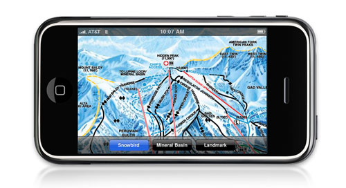
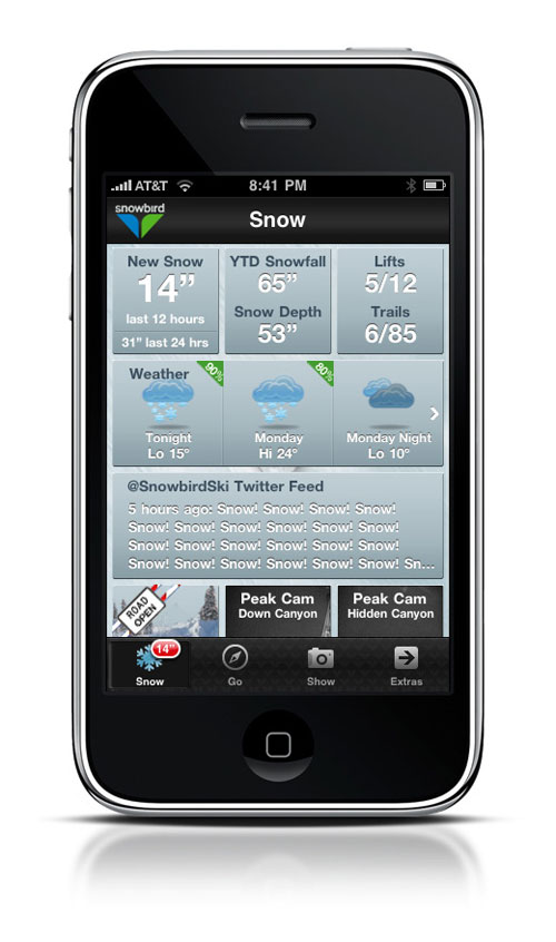
Overall, the app is quite aesthetically pleasing, easy to navigation and simple in it’s labeling structure.  The basic navigation gives you easy access to the sections and content you are looking for…Snow, Go, Show and Extras.

So, what is in the app?  Useful information that is needed while on the mountain or in the village.  Snow fall totals, weather forecast, trail status, twitter feeds from the mountain staff, webcams and a very nice photo uploader.  And that is just a start, there are a few more highlights here and there, but you get the idea, we don’t need to review the design of every component.

Although, we do love the ‘days skied’ function, but I don’t think we will make it to 71.

More importantly, let’s discuss what is not in the app.  Gimmicks and games are left out…no need for some snowboarding ‘avoid the rocks’ game in the app, you are already on a mountain.  Unnecessary content such as endless marketing copy about how great the snow is.  Upfront and obvious advertising that is intrusive to the user experience.  In short, everything that makes so many apps so unsuccessful.

In the end, the Snowbird app is a great branding and marketing extension for the resort, because it delivers a great user experience without trying to deliver a hard marketing message.  They have focused on the core needs of the consumer and built an app around those needs, instead of forcing content where it does not fit.

Truly a great iPhone app template for the rest of our ski resort counterparts.

5 out of 5 birds from the Travel 2.0 team.

(moto, did we miss anything?  Feel free to give us the behind-the-scenes on the development in the comments.)

3 Comments

Filed under Case Study, iPhone, iPhone Apps, Mobile, Snowbird

Case Study: CincinnatiUSA.com

Can we have a to-go box?

Today, a reader request for our Case Study series, CincinnatiUSA.com.  While Cincinnati was not on our original short list for this series, a quick glance at the site revealed some interesting differences between the Cincinnati design and yesterday’s model, Visit Philly.  The opportunity for comparing and contrasting two very different sites was too good to pass up.  And, hopefully, will generate some discussion among our readers.

Now, before we go too much further, a note about our case study series.  Basically, we are simply calling them as we see them.  Simple opinions from two industry peers who have seen a lot of websites.  But don’t take our word as the final answer, you need to test and re-test site elements with your user base.  Your consumers are the final say on whether or not a design, element or article was successful.  Just as you would (hopefully) seek out multiple opinions within your own organization, we urge you to seek out multiple opinions from your consumers.

A bit of background, according to the team at Cincinnati USA, the recent site revamp has included a complete face lift and is resulting in a noticeable increase in traffic.  So, let’s have a look and see what is and is not working on the Cincinnati site.

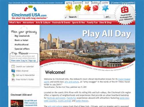
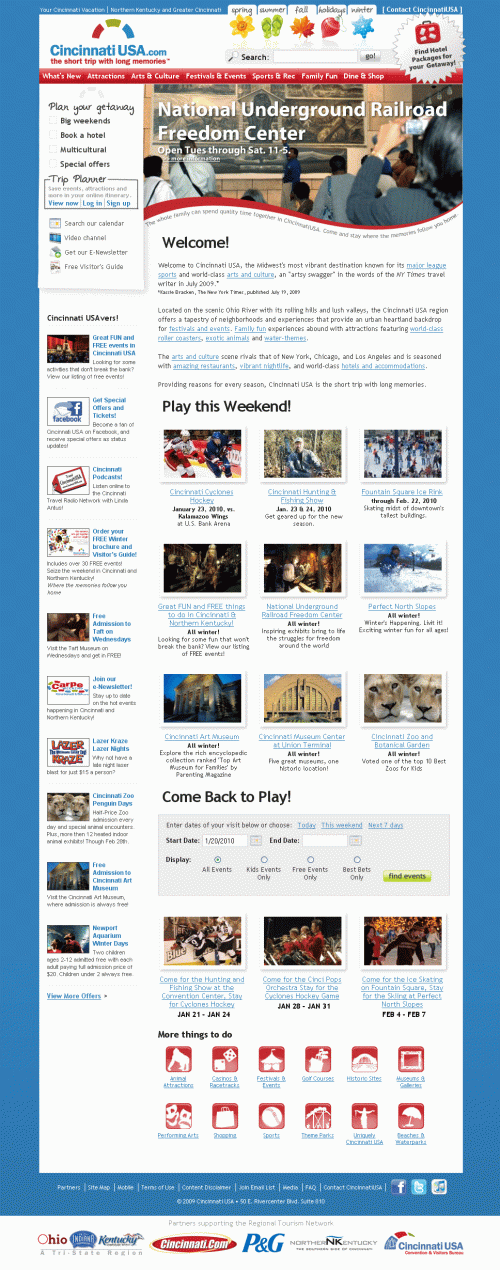
The first difference we see with the strategies of Cincinnati USA and Visit Philly is the amount of content presented to the user ‘above the fold.’  While Visit Philly took the less is more approach, Cincinnati offers a variety of navigational options depending on your traveling perspective.  Standard CVB navigation (Attractions, Dining, etc.), seasonal options and getaway planning are all presented to the user within a few pixels, which makes the header section feel overwhelming.

I would be interested to see some usability testing on this section.  Do consumers need this many options for navigation?  My assumption would be that the incoming traffic is split among these options because the difference between ‘big weekends,’ ‘festivals’ and ‘holidays’ is relatively minor.  Tough to explain what each of those would lead too in just a word or two.

Additionally, I would be paying close attention to the bounce rate from this page.  Too many options causes some users to abandon a session and look for other options.

Further down the page we find a ubiquitous SEO copy block.  Love the inclusion and something I would keep, but it can be shortened to just a single line.  Apologies to my wordy comrades, but no one reads 100% of any copy.  Users skim pages, looking for key indicators to guide their search…especially on the homepage.

On the left side of the page we find a Cincinnati USAvers section.  Ah, I get it, USAvers.  Nice.  Again, while there is a lot of content, considering the current state of the travel budget a front and center acknowledgment of savings is a great way to keep the user engaged.  More coupons, less promotion of podcasts in this section.

In the center of the page, we find an events / attractions combination section.  Basically, highlights of the ‘must see’ attractions in Cincinnati.  Followed by an event search widget, some more event listings and finally icon-based navigation under ‘more things to do.’

Round out the page with partner logos which help set up the creditability of the site and mark it as ‘official’ in the consumer’s mind.

Overall, the theme here is a lot of content and options on the homepage.  Which is striking after looking at the Visit Philly site yesterday.  If you look closely, Visit Philly has just as much, if not more, content that Cincinnati USA.  But Visit Philly employs an effective use of rollovers and tab-based navigation on their homepage.  Essentially hiding content from the users who do not want to see it, but allowing interested consumers to have one-click or mouse-over access.

Which method is more effective?  Hard to say.

From an aesthetic perspective, I prefer the Visit Philly strategy, but again, your consumers decide what works, not the Travel 2.0 blog.

Let’s wrap up this case study by thanking the team at Cincinnati USA for participating in today’s case study.  Being directly compared to another CVB site is certainly not a fair way to determine what is right or wrong, simply a method for showing our readers the differences between the two strategies.  Neither is right nor wrong until the consumer weighs in.

On the Cincinnati chili scale of website design, we will give the new CincinnatiUSA.com a full serving size of 3 out of 5.

Just like the chili, there are a lot of ingredients on that homepage.

2 Comments

Filed under Case Study, Cincinnati, Website Design

Travel Trends: The Sand Printer, Conversationalists

Advertising and exercising in one.

Sand-Printer like a giant die cutter – For today’s edition of Travel Trends, let’s look at an invention that is certainly not hi-tech.  Enter the Sand Printer.  Or, the Beach Hamster (copyright pending).  A giant wheel with lettering on the outside of the rim.  As the rider, or victim, rolls down the beach, a nicely typed message appears in the sand behind them.

From the creators, Zana Design of Spain (sorry, no direct link…a flash site):

The user enters the wheel and with the balance of his weight the wheel will begin turning in the sand at the same time displaying the message.  This is personalized prior to departing, since the letters must be attached to the outside panels of the structure in a workshop.  The message can be a phrase with large letters or a paragraph with small letters.

Sure, it’s cool, but how could I use it?

First, every beach destination in the country should be calling Spain to custom order one of these toys.  Not to mention beach-front hotels, major restaurants, etc, etc.  Honestly, I don’t think we could find a better example of guerrilla advertising combined with such an attention grabbing visual. Reminds us of the brilliant chalkbot from Nike.

Competitive messages for your destination on some other CVB’s beach, URL promotion, coupons, ‘follow me to restaurant X’…endless ideas for messages in the sand.

But why stop there, I know a few winter destinations that could roll out a product like this (pun intended!).  ‘Apres Ski Tonight at Bar X’ would nice is some freshly groomed powder just off of the Crescent Quad lift in Park City.  Okay, people skiing around this wheel might be a bit dangerous, but the effect would still be unique.  (Warning, do not aim Sand Printer down a snowy hill.)

And to top it all off, unlike other guerrilla techniques, this one is eco-friendly, washes or melts away and is not an annoying distraction to your potential audience.

Points to the first DMO to ship one over.

http://blog.makezine.com/

Social Technographics: Conversationalists get onto the ladder – Status updates on Twitter and Facebook now have a home on the social media ladder.  Today, Forrester Research, via the Groundswell blog, added a ‘Conversationalists’ rung to the Social Technographics chart or, simply, the ladder.  Conversationalists are defined as people who update a social network status at least once a week.  Anything less is deemed to be not very conversational.

Additionally, the post included some interesting facts from the full report:

They’re 56% female, more than any other group in the ladder. While they’re among the youngest of the groups, 70% are still 30 and up.

And more detail from the MediaPost report:

Conversationalists are younger than the average adult consumer — 56% female, with household incomes slightly above average and more likely than other social classifications to hold a college degree.

And they’re not just young people. Seventy percent are ages 30 or older. In fact, 36% are 18 to 29; 37% are 30 to 43; 14% are 44 to 53; 9% are 54 to 64; and 4% are 65 and older.

Along with some tips for using this data:

  1. Convince your boss this stuff is for real, and that if you haven’t jumped on it, you’re late.
  2. Profile your customer base, and see what they’re ready for, before planning a project to reach out to them. (After all, People is the first step in the POST process.)
  3. Segment your audience; build different strategies for different segments. (Social is so prevalent now that a single approach for your company is probably too broad.)

http://blogs.forrester.com/groundswell/

2 Comments

Filed under Facebook, Research, Social Media Marketing, Social Networking, Statistics, Trends, Twitter