Today, a reader request for our Case Study series, CincinnatiUSA.com. While Cincinnati was not on our original short list for this series, a quick glance at the site revealed some interesting differences between the Cincinnati design and yesterday’s model, Visit Philly. The opportunity for comparing and contrasting two very different sites was too good to pass up. And, hopefully, will generate some discussion among our readers.
Now, before we go too much further, a note about our case study series. Basically, we are simply calling them as we see them. Simple opinions from two industry peers who have seen a lot of websites. But don’t take our word as the final answer, you need to test and re-test site elements with your user base. Your consumers are the final say on whether or not a design, element or article was successful. Just as you would (hopefully) seek out multiple opinions within your own organization, we urge you to seek out multiple opinions from your consumers.
A bit of background, according to the team at Cincinnati USA, the recent site revamp has included a complete face lift and is resulting in a noticeable increase in traffic. So, let’s have a look and see what is and is not working on the Cincinnati site.
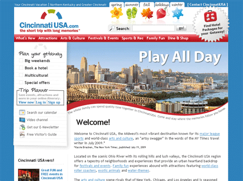
The first difference we see with the strategies of Cincinnati USA and Visit Philly is the amount of content presented to the user ‘above the fold.’ While Visit Philly took the less is more approach, Cincinnati offers a variety of navigational options depending on your traveling perspective. Standard CVB navigation (Attractions, Dining, etc.), seasonal options and getaway planning are all presented to the user within a few pixels, which makes the header section feel overwhelming.
I would be interested to see some usability testing on this section. Do consumers need this many options for navigation? My assumption would be that the incoming traffic is split among these options because the difference between ‘big weekends,’ ‘festivals’ and ‘holidays’ is relatively minor. Tough to explain what each of those would lead too in just a word or two.
Additionally, I would be paying close attention to the bounce rate from this page. Too many options causes some users to abandon a session and look for other options.
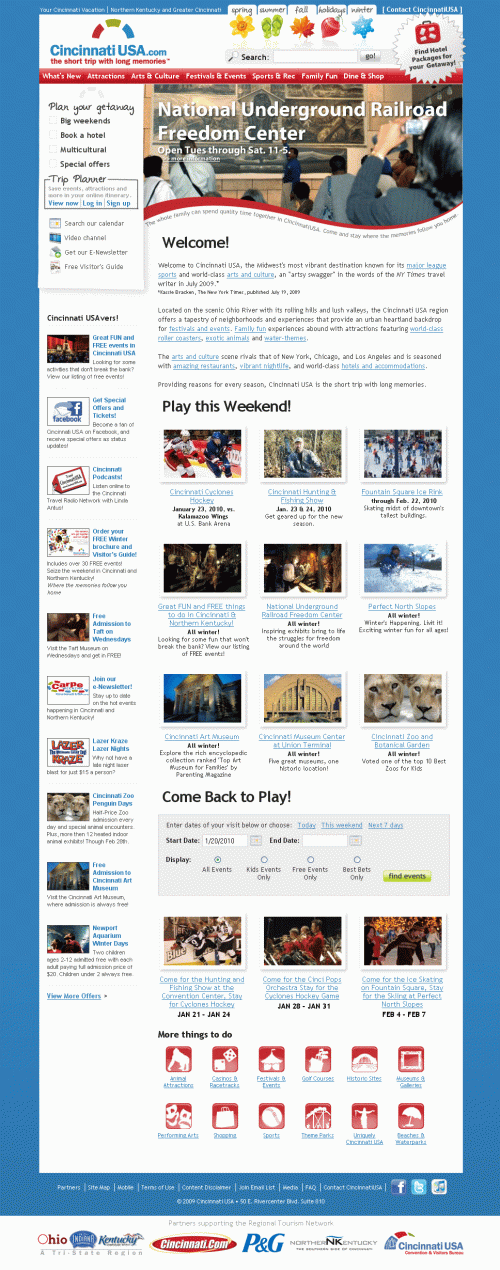
Further down the page we find a ubiquitous SEO copy block. Love the inclusion and something I would keep, but it can be shortened to just a single line. Apologies to my wordy comrades, but no one reads 100% of any copy. Users skim pages, looking for key indicators to guide their search…especially on the homepage.
On the left side of the page we find a Cincinnati USAvers section. Ah, I get it, USAvers. Nice. Again, while there is a lot of content, considering the current state of the travel budget a front and center acknowledgment of savings is a great way to keep the user engaged. More coupons, less promotion of podcasts in this section.
In the center of the page, we find an events / attractions combination section. Basically, highlights of the ‘must see’ attractions in Cincinnati. Followed by an event search widget, some more event listings and finally icon-based navigation under ‘more things to do.’
Round out the page with partner logos which help set up the creditability of the site and mark it as ‘official’ in the consumer’s mind.
Overall, the theme here is a lot of content and options on the homepage. Which is striking after looking at the Visit Philly site yesterday. If you look closely, Visit Philly has just as much, if not more, content that Cincinnati USA. But Visit Philly employs an effective use of rollovers and tab-based navigation on their homepage. Essentially hiding content from the users who do not want to see it, but allowing interested consumers to have one-click or mouse-over access.
Which method is more effective? Hard to say.
From an aesthetic perspective, I prefer the Visit Philly strategy, but again, your consumers decide what works, not the Travel 2.0 blog.
Let’s wrap up this case study by thanking the team at Cincinnati USA for participating in today’s case study. Being directly compared to another CVB site is certainly not a fair way to determine what is right or wrong, simply a method for showing our readers the differences between the two strategies. Neither is right nor wrong until the consumer weighs in.
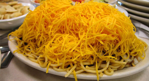
On the Cincinnati chili scale of website design, we will give the new CincinnatiUSA.com a full serving size of 3 out of 5.
Just like the chili, there are a lot of ingredients on that homepage.

